AMIGE
FRBasé à Genève et fondé en 2011, le collectif de graphistes AMI est aujourd’hui composé de Adeline Senn et Martin Maeder.
ENBased in Geneva and founded in 2011, the AMI graphic design collective is now composed of Adeline Senn and Martin Maeder.
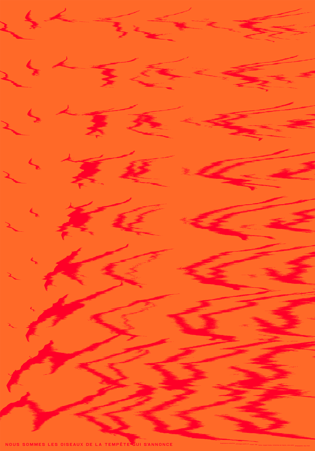
a-m-i.ch @ami__studioFRNous sommes les oiseaux de la tempête qui s'annonce
Le 1er mai 1886, une gigantesque grève a lieu à travers les Etats-Unis pour soutenir la journée de travail de huit heures. À Chicago, bastion de la main-d'œuvre immigrée et des anarchistes, 300’000 travailleurs font grève et défilent dans les rues de la ville. La manifestation est violemment réprimée par la police. Le 4 mai, lors d’un rassemblement contre les violences policières à Haymarket Square, une bombe explose. Huit militants anarchistes sont accusés, puis quatre d’entre eux pendus.
Lors du procès, un des co-accusé, August Spies, déclare: « We are the birds of the coming Storm. » Il a été reconnu par la suite que les accusés n’avaient aucun lien avec cet attentat. Celui-ci ayant été probablement commis pour décrédibiliser le mouvement anarchiste.
Voltairine de Cleyre, anarchiste, militante, féministe et poétesse américaine, rend hommage aux militants devenus martyres. Son poème Hurricane (1889), commence par cette phrase d’August Spies. L’ensemble de ses discours sont rassemblé dans le recueil The First Mayday: The Haymarket Speeches, 1895-1910.
En 2011, Lola Lafon, autrice féministe française, rend hommage à son tour aux événements du Haymarket Square ainsi qu’à Voltairine de Cleyre dans son roman Nous sommes les oiseaux de la tempête qui s’annonce.
Le 1er mai est devenu un jour de rassemblements et de revendications syndicales et sociales.
ENNous sommes les oiseaux de la tempête qui s'annonce
On 1 May 1886, a huge strike took place across the United States in support of the eight-hour work day. In Chicago, a stronghold of immigrant labour and anarchists, 300,000 workers struck and marched through the city streets. The demonstration was violently repressed by the police. On 4 May, during a rally against police violence in Haymarket Square, a bomb exploded. Eight anarchist activists were charged and four of them were hanged. At the trial, one of the co-accused, August Spies, said: "We are the birds of the coming Storm.
It was later acknowledged that the defendants had no connection with the attack. It was probably committed to discredit the anarchist movement.
Voltairine de Cleyre, an American anarchist, activist, feminist and poet, paid tribute to the martyred activists. Her poem Hurricane (1889), begins with this phrase from August Spies. All of her speeches are collected in the book The First Mayday: The Haymarket Speeches, 1895-1910.
In 2011, Lola Lafon, a French feminist writer, paid tribute to the events in Haymarket Square and to Voltairine de Cleyre in her novel We are the birds of the coming storm.
May Day has become a day of rallies and trade union and social demands.
Anna Haas & Gina BurriFR
FRAnna Haas est un studio de design graphique et d'illustration. Après l'Allemagne et les Pays-Bas, le studio est maintenant basé en Suisse. Le travail d'Anna Haas va du design éditorial aux identités visuelles, en passant par les applications numériques, les illustrations, la conception d'affiches et différentes activités d'édition dans les domaines de l'art, de la culture et de la science. Entre 2011 et 2014, des travaux collaboratifs sont apparus occasionnellement sous le nom de Heé Haas. Elle est éditrice et rédactrice en chef de Rivista Apparente, une entreprise indépendante d'édition d'art. En 2014, Heé Haas a cofondé l'association Illustratoren Schweiz. Depuis 2014, elle enseigne à la Haute école des sciences appliquées et des arts de Lucerne (HSLU), département de la communication visuelle. En 2017, elle a initié et gère l'application smartphone Book Cities, un index à but non lucratif des librairies. Son travail a été récompensé par le Swiss Design Award et le Grand Prix de la Biennale internationale de design graphique de Brno. Ses publications ont été sélectionnées par Photo-Eye-Best Photobook et les Plus Beaux Livres Suisses. Membre de l'AGI (alliance graphique internationale) et de Swiss Graphic Designers (SGD).
ENAnna Haas is a graphic design and illustration studio. After Germany and The Netherlands, the studio is now based in Switzerland. The work of Anna Haas ranges from editorial design to visual identities, digital applications, illustrations, poster design and different publishing activities in the fields of art, culture and science. Between 2011 and 2014 collaborative works occasionally appeared under the name of Heé Haas. She is publisher and editor of Rivista Apparente, an independent art publishing venture. In 2014 Haas co-founded the association Illustratoren Schweiz. Since 2014 she teaches at Lucerne University of Applied Science and Arts (HSLU), department of visual communication. In 2017 she initiated and is running the smartphone app Book Cities, a non-profit index of book stores. Her work was awarded with the Swiss Design Award and the Grand Prix of the International Biennial of Graphic Design Brno. Her publications where selected by Photo-Eye—Best Photobook and the Most Beautiful Swiss Books. Member of AGI (alliance Graphic International) and Swiss Graphic Designers (SGD).
FRGina Burri a étudié le design graphique à la Hochschule Design & Kunst de Lucerne. Avec son travail de diplôme « Lichtplakate », elle a été nominée pour le NewOne award. Elle travaille à temps partiel comme graphiste indépendante à Lucerne et est depuis septembre 2022 stagiaire au studio Anna Haas.
ENGina Burri studied graphic design at the Lucerne School of Art & Design. She was nominated for the NewOne Award with her diploma thesis “Lichtplakate”. She works part-time as a freelance graphic designer in Lucerne and is since September 2022 intern at Studio Anna Haas.
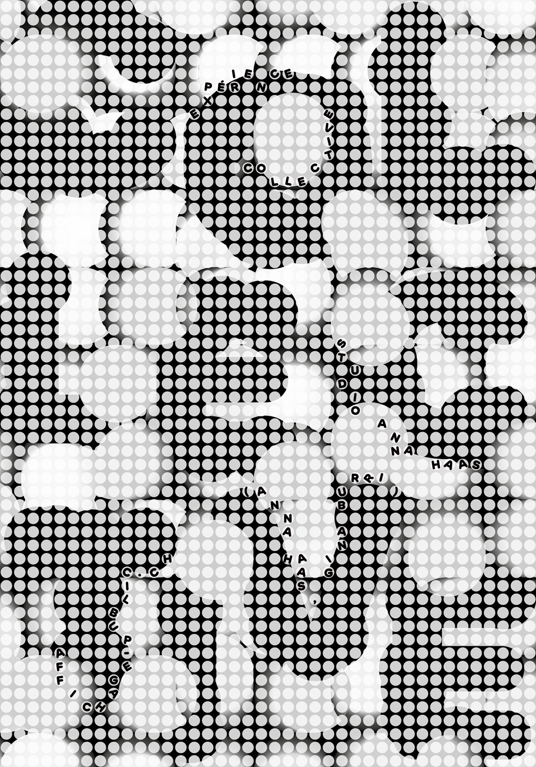
FR Nous faisons toujours partie d'un ensemble : Ce n'est généralement qu'en prenant du recule que nous reconnaissons où notre expérience individuelle devient une expérience collective (ou l'inverse ?). La surimpression de la grille de points blancs, légèrement transparente, rend une lisibilité complète qu'à distance. L'affiche invite à réfléchir à l'effet d'éloignement et de rapprochement, ainsi qu'aux expériences individuelles et collectives.
EN We are always part of a bigger picture: Usually only from a distance in time we recognise where our individual becomes a collective experience (or the other way around?) The overprinting of the white, slightly transparent grid of dots makes the content of the poster comprehensible only from a distance. The poster invites to reflect on the effect of long-distance and close-up effects of the poster, as well as on individual and collective experiences.
Annik TroxlerBS
FRAnnik Troxler a étudié le design graphique à l'Ecole cantonale d'art de Lausanne (ECAL). Avec son mémoire « Vergissmeinnicht », elle a remporté le Concours fédéral de design 2005. En 2006, elle a commencé à travailler comme graphiste indépendante à Bâle et depuis 2011, elle enseigne à l'École de design de Bâle. Annik Troxler a remporté le Grand Prix de l'International Poster Triennale du Museum of Modern Art Toyama au Japon avec « Intimities 2005 » ainsi que le premier prix du Festival International de l'Affiche à Chaumont en 2007 avec l'affiche « Intimities 2007 ». Elle est membre de l’AGI depuis 2013.
ENAnnik Troxler studied graphic design at the Ecole cantonale d'art de Lausanne (ECAL). With her thesis “Vergissmeinnicht” she won the 2005 Federal Design Competition. In 2006 she started working as a freelance graphic designer in Basel and since 2011 she has been teaching at the Basel School of Design. Annik Troxler won the Grand Prix of the International Poster Triennale of the Museum of Modern Art Toyama in Japan with “Intimities 2005” as well as the first prize at the Festival International de l'Affiche in Chaumont in 2007 with the poster “Intimities 2007”. She is a member of the AGI since 2013.
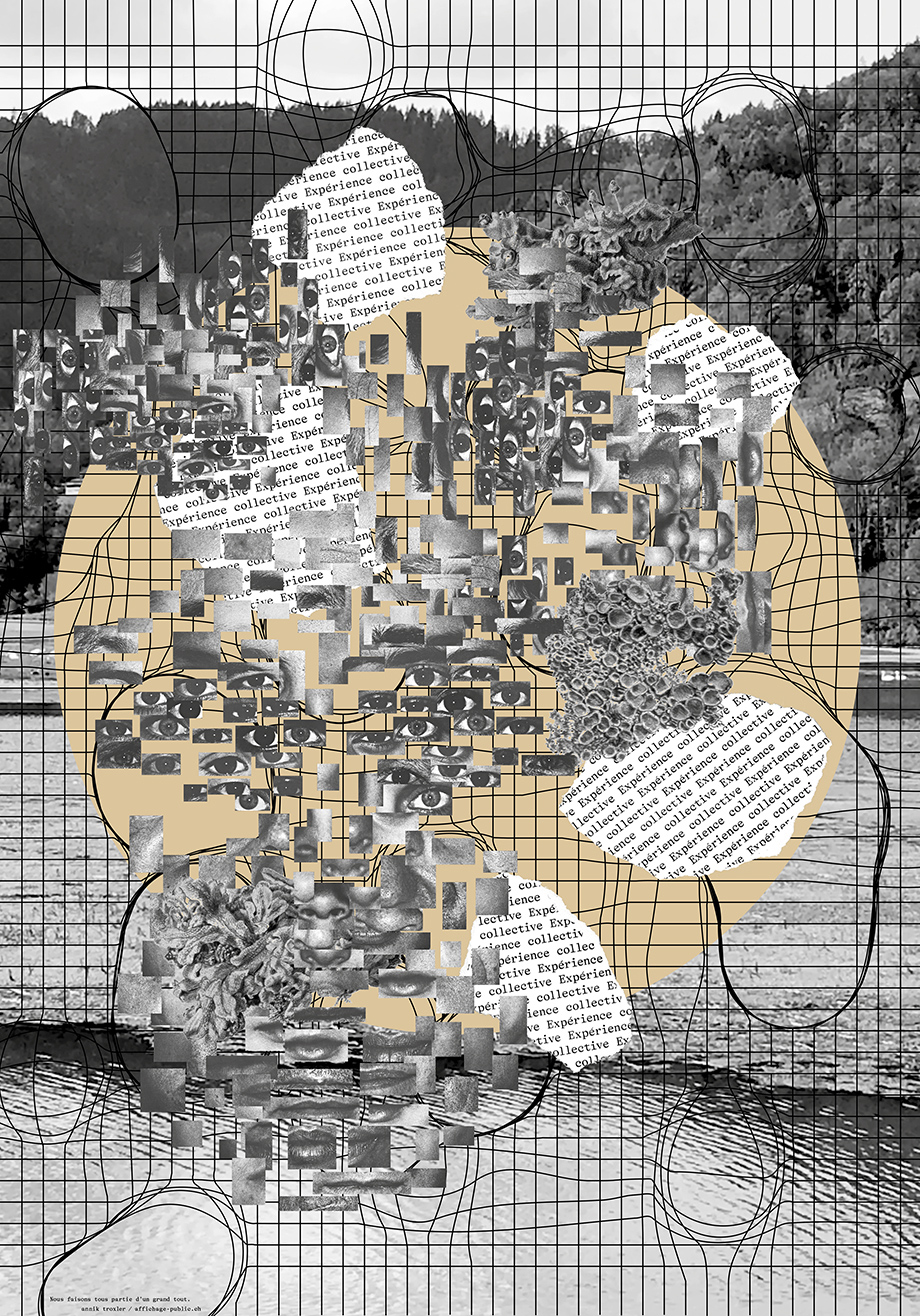
anniktroxler.ch @anniktroxlerFRNous faisons tous partie d'un grand tout
L'affiche peut être une invitation à apprécier consciemment la nature et le fait d'être ensemble. Par exemple, profiter de la forêt, du lac et de la lune – mais à se connecter non seulement avec la nature, mais aussi avec d'autres personnes. Nous faisons tous partie d'un grand tout. Dans l'affiche, peut-être visible sous la forme d'un cercle lumineux ou de la complexité. Il s'agit peut-être de l'univers, de la lune éclairée ou d'un champ énergétique - mais les interprétations sont libres quant à ce qui constitue exactement le lien.
Les êtres humains ont beaucoup de créativité et un grand potentiel ensemble, et je pense que nous pouvons beaucoup apprendre, profiter et faire avancer les choses les uns des autres grâce à tous nos sens. Lorsque nous nous sentons connectés à la nature et aux autres, nous prenons soin les uns des autres, ainsi que de la faune et de la flore.
ENNous faisons tous partie d'un grand tout
The poster can be an invitation to consciously enjoy nature and being together. For example, to enjoy the forest, the lake and the moon – but to connect not only with nature, but also with other people. We are all part of a big whole. In the poster, perhaps visible as a circle of light or complexity. It may be the universe, the illuminated moon or an energy field - but interpretations are free as to what exactly constitutes the connection.
Human beings have a lot of creativity and potential together, and I think we can learn a lot, benefit a lot, and move things forward from each other through all our senses. When we feel connected to nature and to each other, we take care of each other and the wildlife.
C2FLU
FREn 2006, Cybu Richli et Fabienne Burri ont fondé le studio de design C2F à Lucerne, en Suisse. Ils sont spécialisés dans le développement de solutions de communication visuelle uniques. Leurs services couvrent tous les médias : du design éditorial, du design d'information, de la signalétique à l'identité d'entreprise et aux affiches pour des clients culturels et commerciaux qui apprécient le pouvoir du design. Ils travaillent pour des artistes individuels, des bureaux d'architectes, des universités, des musées, des institutions et des marques mondiales : au niveau international avec des clients tels que le New York Times, W.I.R.E.D., Seed Media, I.D. International Magazine, 100 best posters ; avec des clients suisses tels que le Musée historique de Bâle, l'ETH Zurich, Fumetto - Festival international de la bande dessinée de Lucerne, l'Université des sciences appliquées et des arts de Lucerne, la Banque nationale suisse, le Museum für Gestaltung Zürich et bien d'autres encore.
Cybu Richli a étudié l'architecture et la communication visuelle à la Haute école d'art et de design de Lucerne. Après avoir obtenu son diplôme avec les plus hautes distinctions, la société d'investissement Morningstar l'a invité à son siège à Chicago pour mener des recherches sur la visualisation des données financières. Depuis 2011, Cybu Richli est professeur de communication visuelle à la ZHdK - Haute école des arts de Zurich. En tant que chef du département du Master en communication visuelle, il a été responsable du programme jusqu'en 2014. En tant que conférencier et membre du jury, il a été invité au niveau national et international, notamment à Bâle, Berne, Chicago, Hambourg, Hangzhou, Lugano, Luzern, Marrakech, Moskau, San Francisco, Stuttgart et Tel Aviv.
Fabienne Burri a étudié la communication visuelle à la Haute école d'art et de design de Lucerne. Après avoir obtenu son diplôme de designer, elle a travaillé pour plusieurs agences de design et pour le Schauspielhaus de Zurich. Elle a suivi les demandes de conférences et d'ateliers en Europe, au Moyen-Orient et aux États-Unis. Fabienne Burri enseigne à la Haute école des sciences appliquées et des arts de Lucerne. Dans le domaine de l'interdisciplinarité, elle a été responsable de la gestion des modules à la ZHdK - Haute école des arts de Zurich pendant dix ans.
Pour leur travail, ils ont reçu de prestigieux prix et reconnaissances : All Gold of the World, Grand Prix Golden Bee, Awards of Type Directors Club New York, ADC Young Guns, China International Poster Biennial Awards, Lucky Strike Junior Designer Award, Swiss Design Award, The Most Beautiful Swiss Books.
ENIn 2006, Cybu Richli and Fabienne Burri founded the design studio C2F in Lucerne, Switzerland. They specialize in developing unique visual communication solutions. Their services cover all media: from editorial design, information design, signage to corporate identity and posters for cultural and commercial clients who value the power of design. They work for individual artists, architectural offices, universities, museums, institutions and global brands: internationally with clients like The New York Times, W.I.R.E.D., Seed Media, I.D. International Magazine, 100 best posters; with Swiss clients such as Basel Historical Museum, ETH Zurich, Fumetto – International Comic Festival Lucerne, Lucerne University of Applied Sciences and Arts, Swiss National Bank, Museum für Gestaltung Zürich and many more.
Cybu Richli studied architecture and visual communication at the Lucerne University of Art and Design. After graduating with highest honors, the investment company Morningstar invited him to their headquarters in Chicago to conduct research in the visualization of financial data. Since 2011 Cybu Richli is a professor in Visual Communication at the ZHdK – Zurich University of the Arts. As head of the Visual Communication Master Department, he was responsible for the program until 2014. As a guest lecturer and jury member, he has been invited nationally and internationally, to Basel, Bern, Chicago, Hamburg, Hangzhou, Lugano, Luzern, Marrakech, Moskau, San Francisco, Stuttgart, Tel Aviv and other cities.
Fabienne Burri studied visual communication at the Lucerne University of Art and Design. After taking her degree as Designer, she worked for several design agencies and for the Schauspielhaus Zurich. She followed requests for lectures and workshops to Europe, the Middle East and the USA. Fabienne Burri teaches at the Lucerne University of Applied Sciences and Arts. In the field of interdisciplinarity, she was responsible for module management at the ZHdK – Zurich University of the Arts for ten years.
For their work they received prestigious awards and recognitions: All Gold of the World, Grand Prix Golden Bee, Awards of Type Directors Club New York, ADC Young Guns, China International Poster Biennial Awards, Lucky Strike Junior Designer Award, Swiss Design Award, The Most Beautiful Swiss Books.
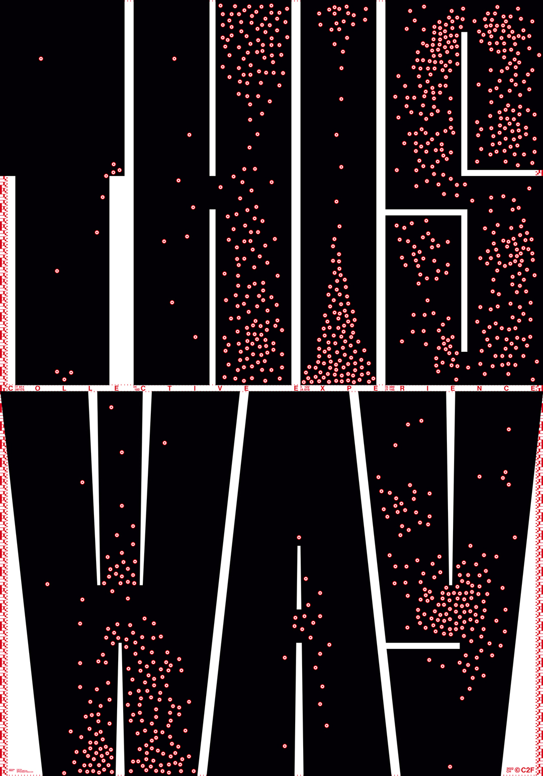
c2f.ch @c2fdesignFRTHIS WAY
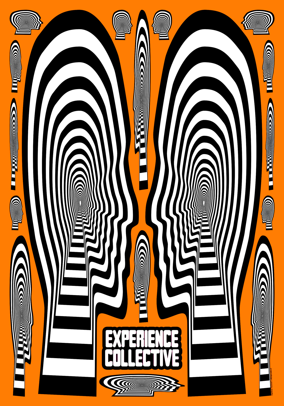
Suivons-nous les masses ? Trouvons-nous des voies individuelles ? Le collectif nous rend-il intelligents ? Dans quelle mesure l'individualisme est-il solidaire ?
« This Way » traite du comportement des individus en groupe, du comportement en essaim et de l'intelligence en essaim.
Le comportement en essaim désigne le comportement des individus à former des agrégations. La formation d'un essaim présente des avantages pour l'individu. La formation d'agrégations protège contre d'éventuels ennemis, par exemple par une vigilance ou une irritation collective.
Le principe du comportement en essaim repose sur trois règles : 1. se déplacer vers le centre de ceux que l'on voit autour de soi. 2. s'éloigner dès que quelqu'un s'approche trop près. 3. se déplacer à peu près dans la même direction que ses voisins.
Le comportement des essaims est-il intelligent ? Quelle est l'intelligence d'un essaim ? L'intelligence d'un essaim est l'utilisation délibérée des capacités des individus et du pouvoir de la foule pour résoudre des problèmes et faire face aux demandes. Un essaim se comporte de manière intelligente sans que l'individu ait besoin d'être particulièrement intelligent pour le faire.
This Way ! ou This Way ?
ENTHIS WAY
Do we follow the masses? Do we find individual paths? Does the collective make us smart? How solidary is individualism?
“This Way” deals with the behaviour of individuals in groups, with swarm behaviour and swarm intelligence.
Swarm behaviour refers to the behaviour of individuals to form aggregations. Swarm formation brings advantages for the individual. Forming aggregations protects against possible enemies, e.g. through collective vigilance or irritation.
The principle of swarm behaviour is based on three rules:
1. move towards the centre of those you see around you.
2. move away as soon as someone gets too close.
3. move in roughly the same direction as your neighbours.
How intelligent is swarm behaviour? How intelligent is a swarm? Swarm intelligence is the purposeful use of the abilities of individuals and the power of the crowd to solve problems and cope with demands. A swarm behaves intelligently without the individual having to be particularly smart to do so.
This Way! or This Way?
Dual RoomBE
FRDual Room est un studio de design graphique créé en 2010 et dirigé par emmanuel Crivelli, diplômé de l'ECAL (Suisse). Dual Room travaille pour des clients dans les domaines culturels et commerciaux avec un accent sur le design éditorial et l'identité de marque.
ENDual Room is a graphic design studio established in 2010 run by emmanuel Crivelli, ECAL graduate (Switzerland). Dual Room works for clients in both cultural and commercial fields with a focus on editorial design and brand identity.
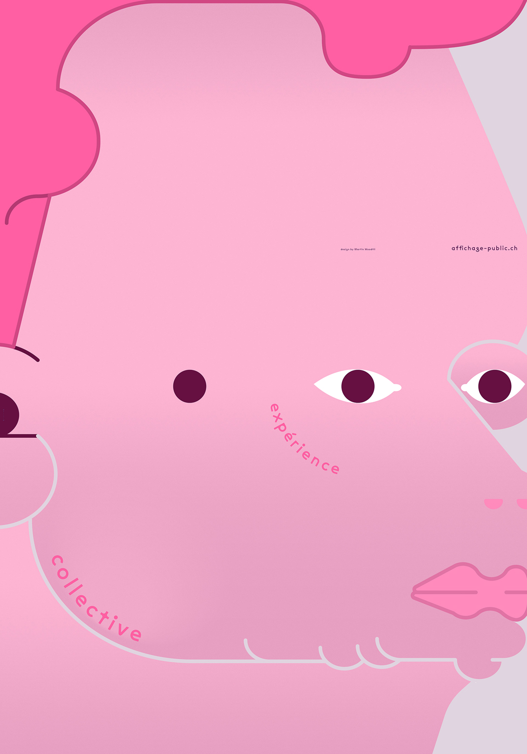
dualroom.ch @dualroomFRLes expériences individuelles qui composent l’expérience collective : l’être est avant tout une vibration consciente.
ENThe individual experiences that make up the collective experience: being is above all a conscious vibration.
EurostandardVD
FREurostandard est un collectif de graphiste basé à Lausanne composé de Ali-Eddine Abdelkhalek, Pierrick Brégeon et Clément Rouzaud.
ENEurostandard is a graphic design collective based in Lausanne composed of Ali-Eddine Abdelkhalek, Pierrick Brégeon and Clément Rouzaud.
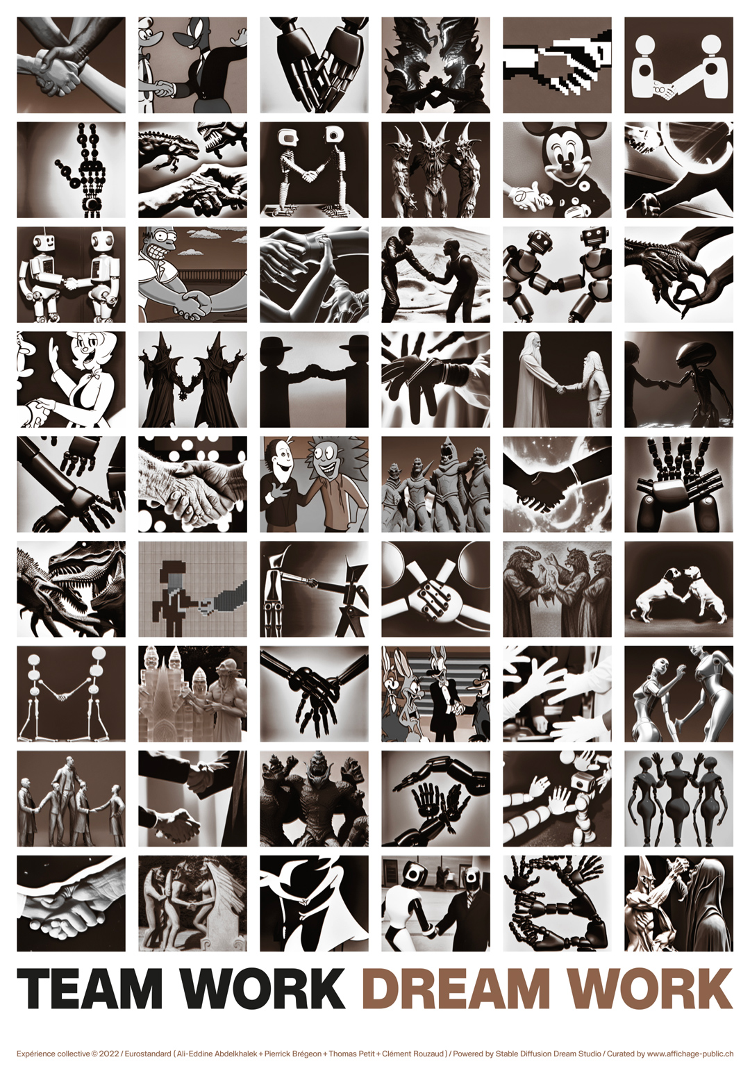
eurostandard.ch @eurostandardFRTeam Work Dream Work (man x machines)
Basée sur les algorithmes d’une Intelligence Artificielle, notre proposition explore ses capacités. C’est une collection de 54 images de poignées de main, de gestes d'affiliation, d'accord ou de confiance. Elle est le résultat généré par l’IA de l'idée de collaboration entre humain et non humain.
ENTeam Work Dream Work (man x machines)
Based on the algorithms of an Artificial Intelligence, our proposal explores its capabilities. It is a collection of 54 images of handshakes, gestures of affiliation, agreement or trust. It is the AI generated result of the idea of collaboration between human and non-human.
Martin WoodtliZH
FRDe 1990 à 1996, Woodtli a étudié la céramique et le graphisme à l'école de design de Berne (SFGB), puis la communication visuelle à la Hochschule für Gestaltung und Kunst Zürich (HGKZ). En 1996, Woodtli commence à travailler dans des contextes subculturels, par exemple pour le Kiosk durch Kunstkanal à Berne. En 1998, il s'installe à New York, où il travaille dans les agences de graphistes de renom tels que David Carson et Stefan Sagmeister. À son retour à Zurich en 1999, il fonde son propre studio. Depuis 2000, il est membre de l'Alliance Graphique Internationale (AGI), depuis 2001, conférencier invité dans diverses institutions en Suisse et à l'étranger.
ENFrom 1990 to 1996, Woodtli studied Ceramics and Graphic Design at the Bern School of Design (SFGB), and then Visual Communications at Hochschule für Gestaltung und Kunst Zürich (HGKZ). In 1996, Woodtli began working in subcultural contexts, for the Kiosk durch Kunstkanal in Bern, for example. In 1998 he moved to New York, where he worked in the agencies of such renowned graphic designers like David Carson and Stefan Sagmeister. Upon his return to Zurich in 1999 he founded his own studio. Since 2000, he has been a member of the Alliance Graphique Internationale (AGI), since 2001, a guest lecturer at various institutions in Switzerland and abroad.
woodt.li @martin_woodtliFRYou and I
Le respect de l'autre est un grand mot, mais il se manifeste déjà dans de petits gestes et actions. Un peu d'attention, un peu d'aide dans une situation de tous les jours. Le respect se manifeste là où l'on se rencontre.
ENYou and I
Respect for the other person is a big word, but it already shows in small gestures and action. A little attention, a little help in an everyday situation. Respect happens where you meet each other.
MaximageGE/ZH
FRMaximage est un studio de design suisse avec des bureaux à Genève, Zurich et Paris. Le studio crée des identités visuelles, des livres, des affiches, des caractères, des solutions numériques et des œuvres d'art. Leurs récentes commandes incluent des livres pour Nike et la Kunsthalle de Bâle.
ENMaximage is a Swiss design studio with offices in Geneva, Zurich and Paris. We create visual identities, books, posters, typefaces, digitals solutions, and artworks. Their recent commissions include books for Nike and Kunsthalle Basel.
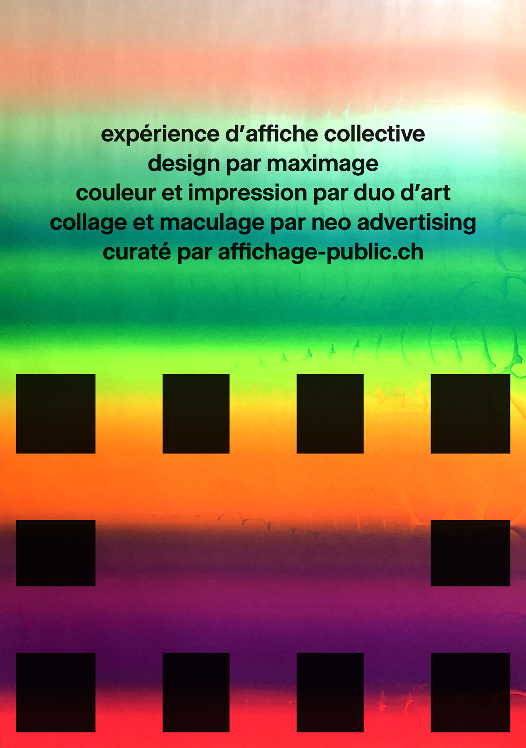
maximage.biz/ @maximage_societe_suisseFRExpérience d’affiche collective, design par Maximage, couleur et impression par Duo d’art, collage et maculage par Neo advertising. (Visuel de l’affiche avant collage). Au fil du temps, l'évolution de l'industrie et la division du travail ont segmenté les rôles entre créateurs et opérateurs. Dans leur pratique, Maximage a toujours remis en question l'opposition entre la conception et la production comme deux étapes distinctes du processus de création. Avec cette expérience d'affiche collective, ils veulent rendre visible le travail et les gestes des individus qui participent à la conception d'une affiche imprimée par leurs connaissances et leurs compétences, mais qui sont souvent invisibles dans le résultat final. Reprenant cette idée de travail collectif, Maximage a demandé aux imprimeurs de choisir librement les couleurs à imprimer comme fond, avec pour seule indication que l'encre devait être à base de solvant. En plus de cela, ils leur ont demandé d'imprimer une deuxième couche avec une encre noire soluble à l'eau, avec leur design. Une fois collée dans la rue, cette couche hydrosoluble réagit au passage du pinceau, laissant des traces sur l'ensemble de l'affiche. Par ce geste, l'afficheur participe à la création finale, complétant ainsi ce processus collectif.
ENCollective poster experiment, design by Maximage, color and printing by Duo d'art, collage and smudging by Neo advertising (Visual of the poster before collage). Over the time, the evolution of the industry and the division of labour have segmented the roles between creators and operators. In their practice, Maximage has always questioned the opposition between design and production as two distinct stages of the creative process. With this collective poster experience, they want to make visible the work and gestures of the individuals who participate in the conception of a printed poster through their knowledge and skills, but who are often invisible in the end result. Taking up this idea of collective work, Maximage asked the printers to choose freely colours to be printed as a background, with the only indication that the ink had to be solvent-based. On top of this, they asked them to print a second layer with a black water-soluble ink, with their design. Once glued in the streets, this water soluble layer reacts to the passage of the brush, leaving marks on the whole poster. By this gesture, the worker who glues the posters takes part in the final creation, thus completing this collective process.
TM — David Mamie et Nicola TodeschiniGE
FRÉtablis à Genève, David Mamie et Nicola Todeschini travaillent ensemble depuis 2010. Leur champ d'activité se situe principalement dans le domaine culturel et éditorial.
ENBased in Geneva, David Mamie and Nicola Todeschini work together since 2010. Their practice is mainly focused on the cultural and editorial fields.
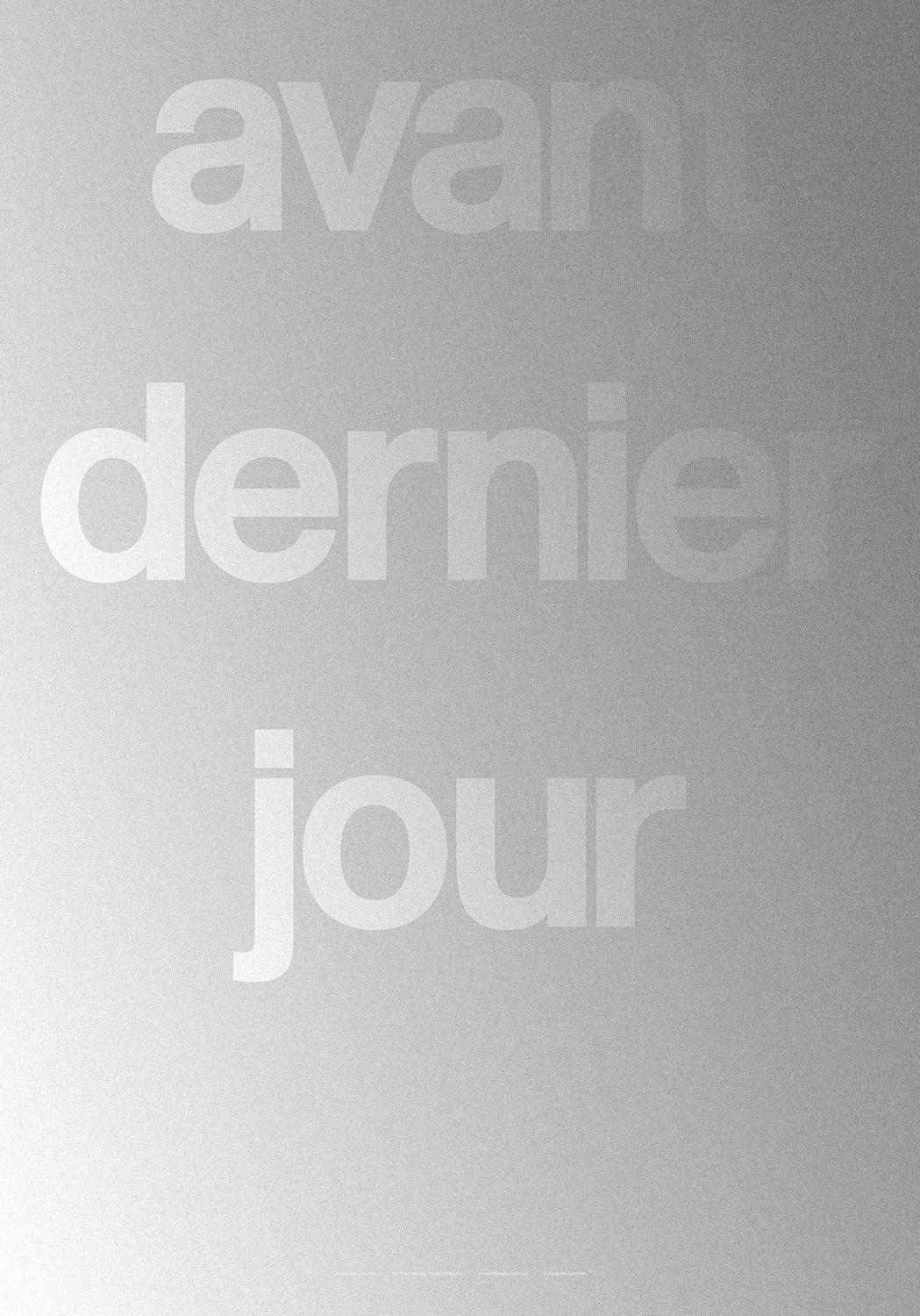
todeschini-mamie.chFREn se jouant des codes de promotion commerciale, cette proposition textuelle imprimée en deux passages d'une même encre argentée, offre une expérience visuelle en apparition/disparition selon l'angle du regard et/ou de la luminosité ambiante. Le message proposé ici se veut ouvert et à interprétation multiple – une invitation à la réflexion sur le temps, la vie, la marche du monde… des expériences collectives fondamentales et universelles.
ENBy playing with the codes of commercial promotion, this textual proposal printed in two layers of the same silver ink, offers a visual experience of appearance/disappearance depending on the view perspective and/or the ambient light. The message proposed is intended to be open and with multiple interpretations – an invitation to reflect on time, life, the world’s march… fundamental and universal collective experiences.